Effortlessly Create Responsive Flex Layouts with TailwindCSS: An In-Depth Guide
Learn how to create a responsive flex layout using TailwindCSS.
In the previous post, we covered how to set up your development environment and get started with TailwindCSS.
Now that our foundation is set, it’s time to focus on one of the most important aspects of web development: creating a responsive flex layout. A responsive website provides a seamless user experience on a variety of devices, from smartphones to laptops and everything in between.
One key property for building responsive websites is CSS flex(also called Flexbox). Flex is a layout model that allows us to easily create and organize our layouts, ensuring that they look great and function properly on any device. In this post, we’ll learn how to use it to create responsive layouts with the help of TailwindCSS but before we jump into the Tailwind classes, let’s understand how traditional CSS handles flexbox.
What is Flexbox?
Flexbox is a powerful layout model for creating layouts. It allows you to easily align elements in rows or columns, and adjust their size and position based on the available space.
With Flexbox, you can create complex, responsive layouts with just a few lines of code, making it a great choice for developers who want to build responsive websites.
Additionally, Flexbox makes it easy to adjust the layout of your page as the size of the screen changes, ensuring that your content is always displayed correctly on any device.
For that, you have to start by defining the property as flex:
display: flex;
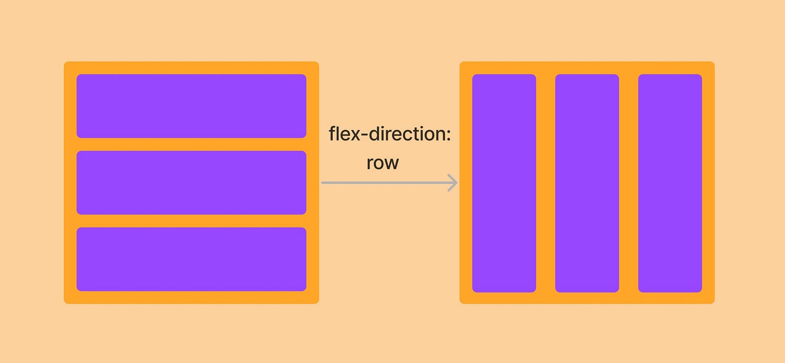
After that, you have to define the direction for aligning the item, it can be a row or column.
display: flex;
flex-direction: row;
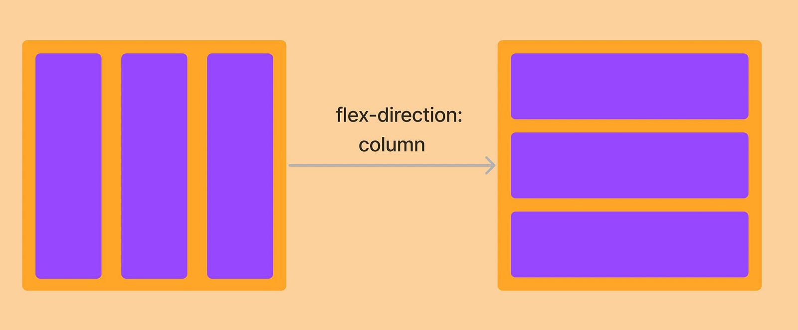
For it align vertically, you have to add the flex direction as a column.
For the above image, the code looks like this:
display: flex
flex-direction: column
Align-Items and Justify-Content Properties
The flex and direction properties in CSS are used to specify the layout of elements within a flex container. However, these properties alone may not be sufficient to achieve the desired layout, especially in more complex scenarios. This is where the Align-Items and Justify-Content properties come into play.
Align-items determines the alignment of items along the cross-axis of the flex container, while justify-content determines the alignment of items along the main axis. These properties allow you to more precisely control the positioning and layout of items within a flex container, enabling you to create more complex and sophisticated layouts.
Let’s take an example.
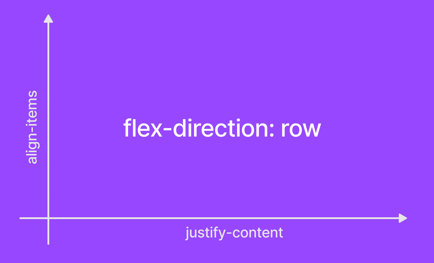
When you set the “flex-direction” property to “row”, the x-axis refers to the horizontal axis and the y-axis refers to the vertical axis.
The justify-content property aligns items along the x-axis (horizontally), while the align-items property aligns items along the y-axis (vertically). For example, if you set justify-content: center, the items in the flex container will be aligned horizontally in the center of the container. Similarly, if you set align-items: center, the items will be aligned vertically in the center of the container.
It’s important to note that the direction of the x-axis and y-axis depends on the value of the flex-direction property. When you set the “flex-direction” property to “row”, the x-axis refers to the horizontal axis and the y-axis refers to the vertical axis. This is important to keep in mind when working with justify-content property.
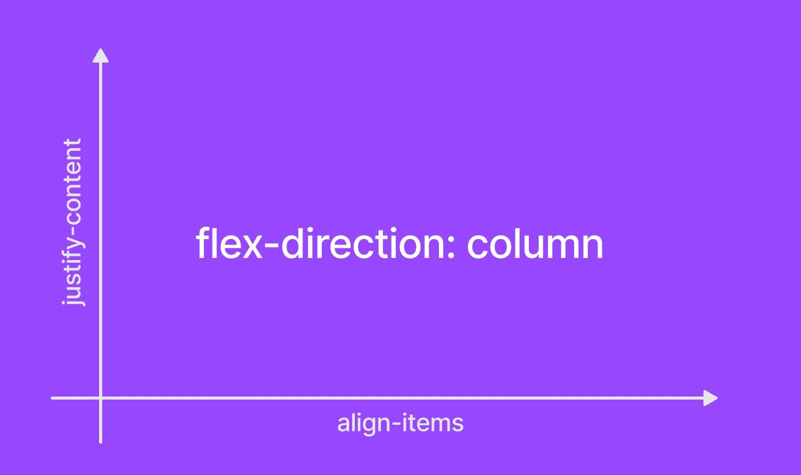
Let’s use another example to understand it better.
When flex-direction is defined as columns, the x-axis is known for align-items and the y-axis is known for justify-content.
Flex-Wrap Property
The flex-wrap property in CSS determines whether flex items are laid out in a single line or wrapped onto multiple lines.
When set to “nowrap”, all flex items are laid out in a single line, even if this requires them to overflow the flex container. And when set to “wrap”, flex items will be wrapped onto multiple lines as necessary to fit within the flex container.
This can be useful for adapting the layout of a flex container to different screen sizes or for creating grid-like layouts.
Getting Started with Responsive Designs
When you visit a website, you will notice that the layout differs between mobile and desktop displays.
It’s all because it should be responsive dependent on screen size, and for that, developers often employ CSS attributes like rem, em, and, most significantly, media queries. Media queries allow you to create several breakpoints based on the screen size to set distinct layouts.
Here is one example,
@media (max-width: 480px) {
  .card {
    font-size: 16px;
    width: 100%;
  }
}
In this case, we’ve defined a card class with a width of just 100% up to 480px.
Similarly, you can set breakpoints based on media queries by adding the max-width or min-width to them.
Based on the Freecodecamp post, here are some common breakpoints that you can adopt.
320px — 480px: Mobile devices
481px — 768px: iPads, Tablets
769px — 1024px: Small screens, laptops
1025px — 1200px: Desktops, large screens
1201px and more — Extra large screens, TV.
Flexbox and Breakpoints in Tailwind CSS: An In-Depth Look
Let’s go deeper into how we can use flexbox inside TailwindCSS.
Using flex in TailwindCSS is straightforward.
<div class="flex flex-row ... ">
  <div class="p-4 text-white bg-red-500 rounded">1</div>
  <div class="p-4 text-white bg-red-500 rounded">2</div>
  <div class="p-4 text-white bg-red-500 rounded">3</div>
  <div class="p-4 text-white bg-red-500 rounded">4</div>
</div>
We simply defined flex and applied a direction to a parent div as flex-row. This makes child divs use the parent div to position themselves within a row.
The output looks like this:
Also, there are predefined breakpoints as well inside the TailwindCSS framework which makes creating responsive designs easier. These breakpoints correspond to the screen size and not the element size.
If you want to use a min-width up to 640px, you should only have to add the “sm” property and so on.
Suppose you want to create a div of different sizes based on different screens, you simply have to define breakpoints using TailwindCSS like this:
<div class="w-16 md:w-32 lg:w-48">My width changes</div>
Here the width of the div is 16 by default (4rem), and in the medium size, it changes to 32 and 48 on the large screens.
These breakpoints are customizable via the tailwind.config.js file.
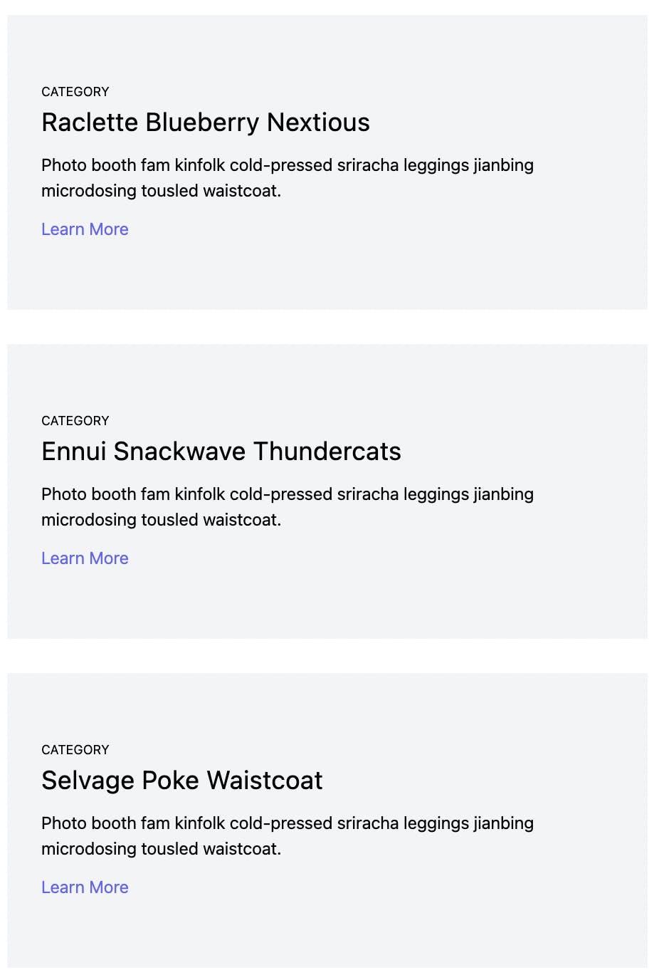
Now, let’s take a more concise example and see how you can build the responsive flex layout using TailwindCSS, where our desktop view will have horizontal items while our mobile layout should be vertical to accommodate smaller screen sizes as shown below
Desktop view:
Mobile View:
The code looks like this:
function App() {
 return (
   <div class="container px-5 py-24 mx-auto flex flex-wrap">
     <div class="h-full p-4 lg:w-1/3">
       <div class=" bg-gray-100 px-8 pt-16 pb-16 relative">
         <h2 class="text-xs mb-1">CATEGORY</h2>
         <h1 class="title-font sm:text-2xl text-xl  mb-3">Raclette Blueberry Nextious</h1>
         <p class="mb-3">Photo booth fam kinfolk cold-pressed sriracha leggings jianbing microdosing tousled waistcoat.</p>
         <a class="text-indigo-500 inline-flex items-center">Learn More</a>
       </div>
     </div>
     <div class="h-full p-4 lg:w-1/3">
       <div class="bg-gray-100 px-8 pt-16 pb-16 relative">
         <h2 class="text-xs mb-1">CATEGORY</h2>
         <h1 class="title-font sm:text-2xl text-xl  mb-3">Ennui Snackwave Thundercats</h1>
         <p class="mb-3">Photo booth fam kinfolk cold-pressed sriracha leggings jianbing microdosing tousled waistcoat.</p>
         <a class="text-indigo-500 inline-flex items-center">Learn More</a>
       </div>
     </div>
     <div class="h-full p-4 lg:w-1/3">
       <div class="bg-gray-100 px-8 pt-16 pb-16 relative">
         <h2 class="text-xs mb-1">CATEGORY</h2>
         <h1 class="title-font sm:text-2xl text-xl mb-3">Selvage Poke Waistcoat</h1>
         <p class="mb-3">Photo booth fam kinfolk cold-pressed sriracha leggings jianbing microdosing tousled waistcoat.</p>
         <a class="text-indigo-500 inline-flex items-center">Learn More</a>
       </div>
     </div>
   </div>
 );
}

export default App;
The code is simple enough, we have used several flex properties and breakpoints to make the responsive flex layout.
Creating a Flex Wrapper Component
You can also create a parent component and wrap a child component and add styles properties to it. This allows us to reuse the wrapper component to implement responsive layouts in multiple places easily.
Let’s see an example.
import React from 'react';

const ParentContainer = ({ children, className }) => {
   return (
       <div className={`flex ${className}`}>
           {children}
       </div>
   );
};

export default ParentContainer;
Create a ParentContainer.js file and write the above code. It will take some props and apply some style properties to the div.
import ParentContainer from './ParentContainer';

const App = () => {
 return (
   <ParentContainer className="items-center justify-center h-screen bg-red-500 text-white">
     <p>I am a child wrapped in a flex container!</p>
   </ParentContainer>
 );
}

export default App;
Now inside App.js, use the ParentContainer component and write some content inside the p tag. The properties that we have passed here will get used by the ParentContainer component.
Here is the output.

Go from Design to Responsive Code
You can also generate responsive code directly from your design files in Figma and Adobe XD using the Locofy.ai plugin.
Locofy automatically picks up your Figma auto layout settings and constraints to generate responsive code with flex properties. Additionally, the auto layout facilitates the design process and allows you to create designs faster with cleaner structures, as shown in our recent guide.
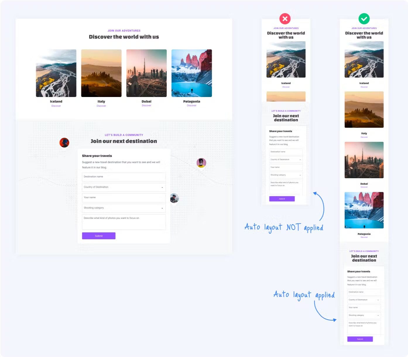
What’s more is that you can also configure layout direction for different breakpoints using the plugin, enabling you to directly go from design to pixel-perfect responsive code.
The code can be generated in React, React Native, Next.js, and Gatsby as well as HTML-CSS.
Generate responsive code using Locofy.ai for free.
Hope you like it.
That’s it — thanks.

