How to Create a Responsive Navigation Bar With TailwindCSS
Learn how to build a mobile-friendly navbar using TailwindCSS and React.


Are you tired of struggling to create a visually pleasing and functional navbar for your website? Look no further! In this guide, we will uncover the simplest way to craft a responsive navbar using the power of TailwindCSS and React.
Navbar is a crucial component of any website as it serves as a navigation hub for visitors to easily access different pages and sections of the site. It is often placed at the top of the page, and can include links, dropdown menus, and even search functionality. But creating a navbar can be a daunting task for some, especially if you're new to web development.
In this blog, we're going to explore the easiest way to create a responsive navbar using TailwindCSS and React. TailwindCSS is a popular utility-first CSS framework that makes it easy to build responsive and consistent layouts & with React we can add dynamic functionality to our navbar.
Let's get started.
Setting Up the Development Environment
When you want to utilize or employ TailwindCSS inside a React app, you must first set it up and configure it.
First, create a React app by running the command: "npx create-react-app my-app"
Next, install TailwindCSS and other dependencies like "postcss" and "autoprefixer" using the command: "npm install -D tailwindcss postcss autoprefixer"
Create config files by running the command: "npx tailwindcss init -p" and open the tailwind.config.css file and replace the content with the provided code snippet.
/** @type {import('tailwindcss').Config} */

module.exports = {
content: [
   "./src/**/*.{js,jsx,ts,tsx}",
 ],
 theme: {
   extend: {},
 },
 plugins: [],
}
- Lastly, paste the following code snippet inside the src/index.css file:
@tailwind base;
@tailwind components;
@tailwind utilities;
You can now use TailwindCSS in your React app. Here is the blog article covering the installation process in-depth.
Creating a Simple Responsive Navbar
By default, TailwindCSS utilizes a mobile-first approach to breakpoints, similar to other popular frameworks such as Bootstrap.
This means that when we design for different screen sizes, the default properties, such as flex, will apply to all screen sizes, while the breakpoint properties, like "md:flex-row", will only take effect at and above the medium screen size(768px) breakpoint.
Let's see the code to grasp it more easily.
<div class="container mx-auto flex flex-wrap p-5 flex-col items-center">
     <a class="flex title-font font-medium items-center text-gray-900 mb-4">
       <img src={locofy} />
     </a>
     <div class="flex flex-wrap items-center text-base justify-center">
       <a class="mr-5">First Link</a>
       <a class="mr-5">Second Link</a>
       <a class="mr-5">Third Link</a>
       <a class="mr-5">Fourth Link</a>
     </div>
     <button class="inline-flex items-center bg-yellow-500 border-0 py-1 px-3 mt-4">Click Me</button>
</div>
Here, by adding TailwindCSS properties, we have created a simple navbar.
Most of the code above will make sense if you are familiar with CSS properties. In short, we have created a container, added an auto margin along the x-axis, and some other properties like a flex column, items center, etc.
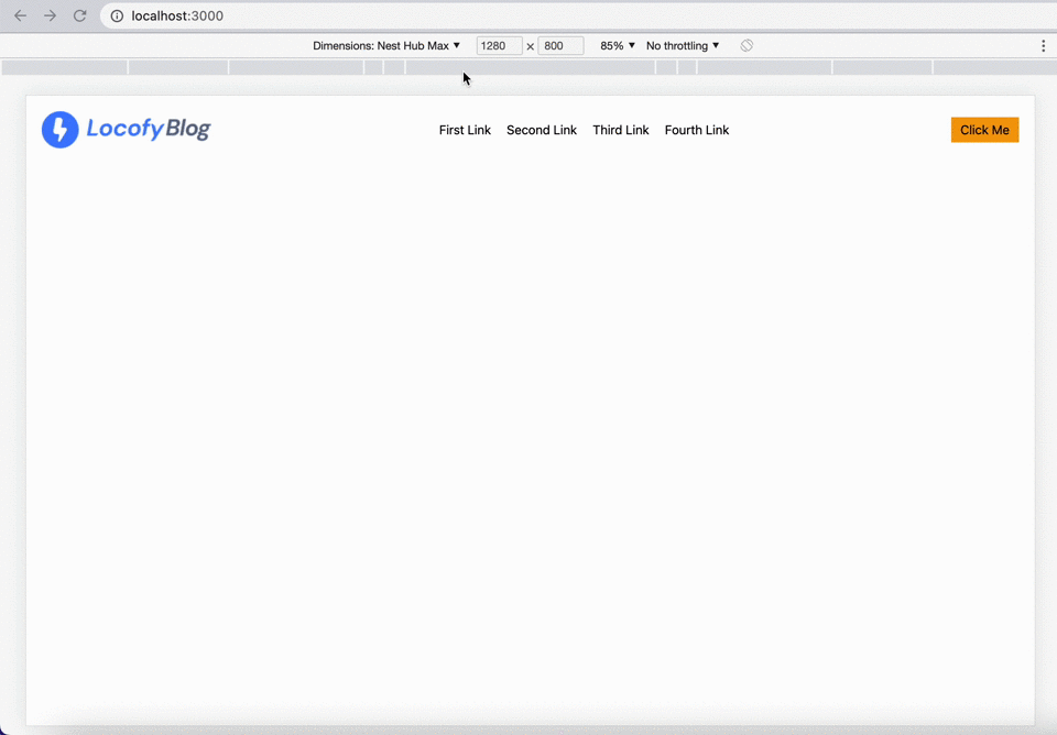
Because of this, the anchor, div, and button tags are automatically arranged in distinct rows using the navbar's default flex-col attribute.
It will look like this:

How about the desktop view, though? The same view will be accessible on the desktop as well because we haven't introduced any media queries.
And this is where TailwindCSS breakpoints are useful.
With the help of these breakpoints, it's become a lot simpler to create responsive layouts.
Let's say that screen size >= 768px, we want to arrange all the navbar elements in a single row. For that, we may use "md:flex-row" in such a situation. With this, the navbar item will be positioned in a single row whenever the screen size reaches 768px as a result of this property.
Here is the code for that.
<div class="container mx-auto flex flex-wrap p-5 flex-col md:flex-row items-center">
     <a class="flex title-font font-medium items-center text-gray-900 mb-4 md:mb-0">
       <img src={locofy} />
     </a>
     <div class="md:ml-auto md:mr-auto flex flex-wrap items-center text-base justify-center">
       <a class="mr-5">First Link</a>
       <a class="mr-5">Second Link</a>
       <a class="mr-5">Third Link</a>
       <a class="mr-5">Fourth Link</a>
     </div>
     <button class="inline-flex items-center bg-yellow-500 border-0 py-1 px-3 mt-4 md:mt-0">Click Me</button>
  </div>
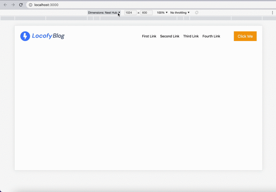
Similar to "md:flex-row", we've included some related breakpoint properties like
"md:mb-0":- Since at the screen size of 768 pixels and above every item is placed in a single row, so we don't need to add a bottom margin.
"md:ml-auto md:mr-auto":- To add space between the links on the left and right sides.
"md:mt-0":- After the screen is 768px or more, set the margin-top to 0 for the button.
Here is the output:
Creating a Responsive Navbar With a Hamburger Menu
On mobile screens, hamburger menus, which are used by the majority of websites, seem more attractive and are a popular choice to show navigation links on smaller devices.
We'll need to use React hooks to build a hamburger menu.
First, we will import the useState hook from the React library.
We can then use the useState hook to create a new state variable called "isOpen" which will keep track of whether the hamburger menu is currently open or closed.
import React, { useState } from 'react';
const [isOpen, setIsOpen] = useState(false);
Here, we set the initial state of "isOpen" to false, since we want the menu to be closed when the page first loads.
Now we'll write some code to make the hamburger menu appear on smaller displays.
<div className="block lg:hidden">
        <button
          onClick={() => setIsOpen(!isOpen)}
          className="flex items-center px-3 py-2 rounded text-black-500 hover:text-black-400"
        >
          <svg
            className={`fill-current h-3 w-3 ${isOpen ? "hidden" : "block"}`}
            viewBox="0 0 20 20"
            xmlns="http://www.w3.org/2000/svg"
          >
            <path d="M0 3h20v2H0V3zm0 6h20v2H0V9zm0 6h20v2H0v-2z" />
          </svg>
          <svg
            className={`fill-current h-3 w-3 ${isOpen ? "block" : "hidden"}`}
            viewBox="0 0 20 20"
            xmlns="http://www.w3.org/2000/svg"
          >
            <path d="M10 8.586L2.929 1.515 1.515 2.929 8.586 10l-7.071 7.071 1.414 1.414L10 11.414l7.071 7.071 1.414-1.414L11.414 10l7.071-7.071-1.414-1.414L10 8.586z" />
          </svg>
        </button>
</div>
Let's explain the code line by line.
The outer div is using the utility class block to make the div always visible on smaller screens and uses the "lg:hidden" class to hide it on larger screens.
Inside this div, there is a button element that serves as the hamburger menu toggle. The onClick event is being used to toggle the state of the menu by calling the setIsOpen function, which flips the value of the isOpen state variable.
The button has several classes added to it to style it, such as "flex", "items-center", "px-3", "py-2", "rounded", "text-black-500", and "hover:text-black-400". These classes are used to align the button contents, add padding, change text color and background color on hover, and more.
Inside the button, there are two SVG elements, each representing one of the two possible states of the hamburger menu icon (open or closed). The className attribute is used to set the class of each SVG element, with the class being determined by the value of the isOpen state variable.
The last step is to write the code necessary to produce a responsive navigation bar that changes its content based on user interactions with the hamburger menu.
<div className={`w-full block flex-grow lg:flex lg:items-center lg:w-auto ${isOpen ? "block" : "hidden"}`} >
        <div className="text-sm lg:flex-grow">
          <a href="#" className="block mt-4 lg:inline-block lg:mt-0 text-white-200 mr-4">
            First Link
          </a>
          <a href="#" className="block mt-4 lg:inline-block lg:mt-0 text-white-200 mr-4">
            Second Link
          </a>
          <a href="#" className="block mt-4 lg:inline-block lg:mt-0 text-white-200 mr-4">
            Third Link
          </a>
          <a href="#" className="block mt-4 lg:inline-block lg:mt-0 text-white-200 mr-4">
            Fourth Link
          </a>
        </div>
        <div>
          <button className="inline-flex items-center bg-amber-500 border-0 py-2 px-4 text-white">
            Click Me
          </button>
        </div>
</div>
Let's explain this code line by line.
The outer div uses the class "w-full" block to make the div take up the full width of its parent container. The class "flex-grow" is making the div take up any available space within its parent container. The class "lg:flex lg:items-center lg:w-auto" is making the div display as a flex container on larger screens, aligning its child elements vertically and horizontally centered, and taking up the full width of its parent container.
The class "${isOpen ? "block" : "hidden"}" is used to toggle the visibility of the div based on the state of the menu. When the isOpen state is true, the div will be shown, otherwise, it will be hidden.
Inside the div, there are two child divs, one for the links and one for the button.
The first child div contains several elements, each representing a link in the menu. The classes "text-sm lg:flex-grow" are used to style the text of the links, making it smaller on smaller screens and making it take up the remaining space on larger screens. The classes "block mt-4 lg:inline-block lg:mt-0 text-white-200 mr-4" are used to align the links vertically on smaller screens and horizontally on larger screens, and to add margin and color to the links.
The second child div contains an element. The classes "inline-flex items-center bg-amber-500 border-0 py-2 px-4 text-white" are used to style the button, align the button contents, adding background color, padding, and text color.
The output looks like this:
This is how the whole code appears:
import React, { useState } from 'react';
import locofy from "./locofy.png"

function App() {
 const [isOpen, setIsOpen] = useState(false);

 return (
   <nav className="flex items-center justify-between flex-wrap p-6">
     <div className="flex items-center flex-shrink-0 text-white mr-6 lg:mr-72">
       <img src={locofy} className="w-100 h-10 mr-2" alt="Logo" />
     </div>
     <div className="block lg:hidden">
       <button
         onClick={() => setIsOpen(!isOpen)}
         className="flex items-center px-3 py-2 rounded text-black-500 hover:text-black-400"
       >
         <svg
           className={`fill-current h-3 w-3 ${isOpen ? "hidden" : "block"}`}
           viewBox="0 0 20 20"
           xmlns="http://www.w3.org/2000/svg"
         >
           <path d="M0 3h20v2H0V3zm0 6h20v2H0V9zm0 6h20v2H0v-2z" />
         </svg>
         <svg
           className={`fill-current h-3 w-3 ${isOpen ? "block" : "hidden"}`}
           viewBox="0 0 20 20"
           xmlns="http://www.w3.org/2000/svg"
         >
           <path d="M10 8.586L2.929 1.515 1.515 2.929 8.586 10l-7.071 7.071 1.414 1.414L10 11.414l7.071 7.071 1.414-1.414L11.414 10l7.071-7.071-1.414-1.414L10 8.586z" />
         </svg>
       </button>
     </div>
     <div
       className={`w-full block flex-grow lg:flex lg:items-center lg:w-auto ${isOpen ? "block" : "hidden"}`}
     >
       <div className="text-sm lg:flex-grow">
         <a href="#" className="block mt-4 lg:inline-block lg:mt-0 text-white-200 mr-4">
           First Link
         </a>
         <a href="#" className="block mt-4 lg:inline-block lg:mt-0 text-white-200 mr-4">
           Second Link
         </a>
         <a href="#" className="block mt-4 lg:inline-block lg:mt-0 text-white-200 mr-4">
           Third Link
         </a>
         <a href="#" className="block mt-4 lg:inline-block lg:mt-0 text-white-200 mr-4">
           Fourth Link
         </a>
       </div>
       <div>
         <button className="inline-flex items-center bg-amber-500 border-0 py-2 px-4 text-white">
           Click Me
         </button>
       </div>
     </div>
   </nav>
 );
}
export default App;
Beyond Navigation: The Versatility of TailwindCSS in Web Design
As you can see, creating a responsive navigation bar with TailwindCSS is a lot easy and it provides a wide range of pre-defined classes and utilities that can easily be used to design a navigation bar that adjusts seamlessly to different screen sizes.
Not only does this make the navigation bar more user-friendly, but it also allows for greater flexibility in web design.
Well, TailwindCSS is not limited to just navigation, it can be used for styling other parts of the website, making it an all-in-one solution for web designers looking to create a cohesive design with minimal effort.
Moreover, TailwindCSS provides a comprehensive design system out of the box as well.
In other words, incorporating TailwindCSS into web design can greatly improve the overall aesthetic and functionality of a website.
Go from Design to Responsive Code
You can also generate responsive code directly from your design files in Figma and Adobe XD using the Locofy.ai plugin.
Locofy automatically picks up your Figma auto layout settings and constraints to generate responsive code with flex properties.
Additionally, the auto layout facilitates the design process and allows you to create designs faster with cleaner structures, as shown in our recent guide.
What's more is that you can also configure layout direction for different breakpoints using the plugin, enabling you to directly go from design to pixel-perfect responsive code.
The code can be generated in React, React Native, Next.js, and Gatsby as well as HTML-CSS.
Hope you like it.
That's it - thanks.