React Form Validations Made Easy — The Ultimate Cheat Sheet
In this step-by-step tutorial, you will learn how to validate forms with and without libraries
Form validation is an integral part of web development since it protects the correctness and security of user inputs. And failure to verify forms can lead to a variety of issues, including improper data storage, security risks, and a negative user experience.
Fortunately, adding form validation to a React application is simple and can be done in a few different ways. For instance, you can quickly add validation to your forms and provide a more secure and user-friendly experience for your users by using the power of React or using third-party npm packages.
This post will go over the various ways for implementing form validation in React, providing you with the knowledge and libraries you need to consistently validate your forms.
Let’s start by creating a basic form.
Creating a Form in React
We’ll begin by creating a simple form with a few input fields and a submit button. The form component will use the useState hook to keep track of the form’s data as the user enters it.
import React, { useState } from "react";
import "./app.css";

const App = () => {
 const [email, setEmail] = useState("");
 const [password, setPassword] = useState("");

 const handleSubmit = (e) => {
   e.preventDefault();
   alert("The email address and password are " + email + " and " + password + " respectively.");
 };

 return (
   <div className="app">
     <form onSubmit={handleSubmit} autocomplete="off">
       <h1>Register</h1>
       <div className="formInput">
         <label>Email</label>
         <input
           type="email"
           name="email"
           value={email}
           placeholder="Enter your email..."
           onChange={(e) => setEmail(e.target.value)}
         />
       </div>
       <div className="formInput">
         <label>Password</label>
         <input
           type="password"
           name="password"
           value={password}
           placeholder="Enter a strong password..."
           onChange={(e) => setPassword(e.target.value)}
         />
       </div>
       <button>Submit</button>
     </form >
   </div >
 );
};

export default App;
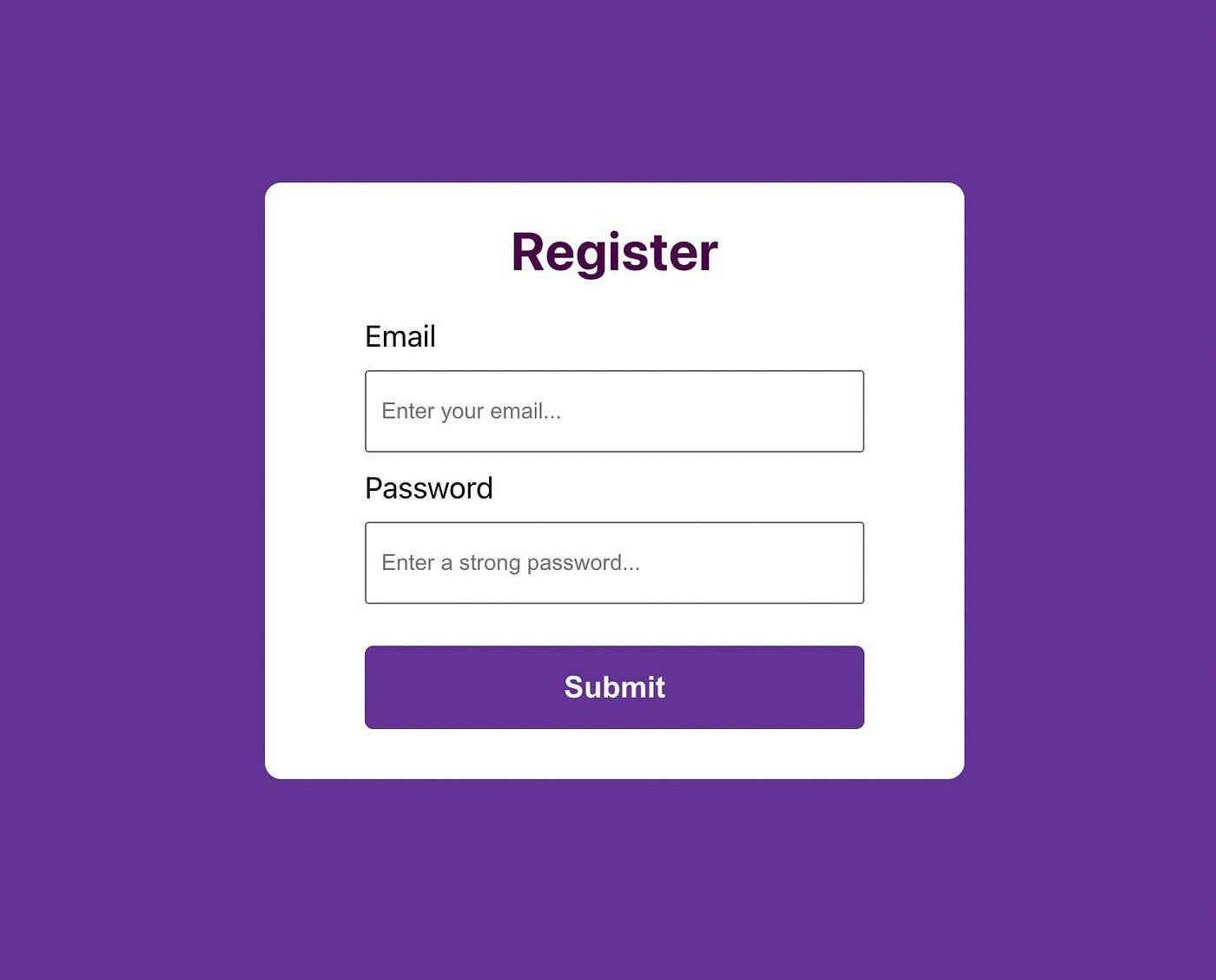
Here, we have defined a functional React component that creates a simple registration form.
The component uses the useState hook to manage the state of the email and password inputs. The state is updated whenever the input values change, via the onChange event handlers.
Inside the component, there is a form with two inputs: one for the email, one for the password, and a submit button.
The “handleSubmit” function is triggered when the form is submitted, and it prevents the default form submission behavior and alerts what the user has entered. This function is mainly used to send the form data to a server.
Lastly, we have applied some CSS properties to style our form.
Here is what it looks like:

Validating the Form Without an External Library
In the above code, we have used some simple validation by specifying the input types as “email” and “password”. This tells the browser what inputs to expect and performs rudimentary validation tests.
However, there is no consistent validation to determine whether or not the user entered a strong password. That is where pattern matching will come in handy. And if the password is incorrect, we will display an error.
To do this, we’ll create a regular pattern expression in our “handleSubmit” function and perform our custom validation before finally submitting our form data to a database.
const handleSubmit = (e) => {
   e.preventDefault();
   const passwordPattern = /^(?=.*[0-9])(?=.*[a-zA-Z])(?=.*[!@#$%^&*])[a-zA-Z0-9!@#$%^&*]{8,20}$/;

   if (!passwordPattern.test(password)) {
     setPasswordError("Password requirements: 8-20 characters, 1 number, 1 letter, 1 symbol.");
     return;
   }
   // setPasswordError("");
   alert("The email address and password are " + email + " and " + password + " respectively.");
 };
First, understand the pattern that we have used here.
const passwordPattern = /^(?=.*[0-9])(?=.*[a-zA-Z])(?=.*[!@#$%^&*])[a-zA-Z0-9!@#$%^&*]{8,20}$/;
This is a regular expression pattern that validates a password string. The pattern enforces the following rules for a password:
Must contain at least one digit (0–9).
Must contain at least one letter (a-z or A-Z).
Must contain at least one special character (!@#$%^&*).
Must be between 8 and 20 characters long.
Only allowed characters are letters (a-z or A-Z), digits (0–9), and special characters (!@#$%^&*).
The pattern uses positive lookahead assertions (?=) to enforce these rules without consuming any characters in the input string.
Now, let’s understand the code that we have written here.
When a form is submitted, the “handleSubmit” method is called. It uses a regular expression to validate the password and displays an error message if it does not fit the requirements. If the password is correct, an alert containing the email and password is displayed.
Also, you can use the “onFocus” function useful for effectively reset the error message to be displayed. This allows the user to clear the error message and enter a new password if their previous attempt did not meet the password requirements.
Validating the Form With the React-Hook-Form Library
An alternative to writing these complex validations by yourself is to use a library, such as react-hook-form. This library provides a simple and efficient way to handle form validation, including input validation and error handling.
To use react-hook-form, we’ll start by installing the library:
npm install react-hook-form
Once installed, we can import the “useForm” hook and use it to manage our form state and validation. Here’s an example of how to use react-hook-form to validate the form we created earlier:
import { useForm } from "react-hook-form";
import "./app.css";

const App = () => {
 const { handleSubmit, register, formState: { errors } } = useForm();
 const onSubmit = values => alert(values.email + " " + values.password);

 return (
   <div className="app">
     <form onSubmit={handleSubmit(onSubmit)}>
       <h1>Register</h1>
       <div className="formInput">
         <label>Email</label>
         <input
           type="email"
           {...register("email", {
             required: "Required",
             pattern: {
               value: /^[A-Z0-9._%+-]+@[A-Z0-9.-]+\.[A-Z]{2,}$/i,
               message: "invalid email address"
             }
           })}
         />
         {errors.email && errors.email.message}
       </div>
       <div className="formInput">
         <label>Password</label>
         <input
           type="password"
           {...register("password", {
             required: "Required",
             pattern: {
               value: /^(?=.*[0-9])(?=.*[a-zA-Z])(?=.*[!@#$%^&*])[a-zA-Z0-9!@#$%^&*]{8,20}$/,
               message: "Password requirements: 8-20 characters, 1 number, 1 letter, 1 symbol."
             }
           })}
         />
         {errors.password && errors.password.message}
       </div>
       <button type="submit">Submit</button>
     </form>
   </div>
 );
};

export default App;
Here, we have used the “useForm” hook from the library to manage the form state, including form data and validation errors.
The email and password input fields use the register method from the “useForm” hook to register the fields and their respective validation rules. If the validation fails, the errors will be stored in the errors object, and the error message will be displayed to the user.
On form submit, the “handleSubmit” function from the “useForm” hook is called, passing “onSubmit” as an argument. “onSubmit” is a callback function that gets the form values and displays an alert message with the entered email and password values.
Make Form Validations Easy with Third-Party Libraries
From the above examples, we can conclude that form validation aids in ensuring that the data entered into a form is accurate and complete. While it is possible to create custom validation logic in React, libraries such as “react-hook-form” can speed up the process and provide a more user-friendly submission experience.
Additionally, there are more npm packages such as Formik and zod that come equipped with a range of features that can enhance the form validation process.
Regardless of the approach you use, it is essential to keep the validation process straightforward, efficient, and user-friendly to provide a positive user experience.
Generate React Form Directly From Figma
You can generate form components directly from your design files in Figma and Adobe XD using the Locofy.ai plugin.
The Locofy.ai plugin provides a comprehensive list of tags that you can use to turn your design elements into working React components.
Locofy.ai also uses AI-powered features such as Auto Tagging & Auto Components to scan your design files and suggest you relevant tags and split your design into modular components for easier code management and extensibility.
What’s more is that you can generate responsive code by configuring the layout direction for different breakpoints using the plugin, enabling you to directly go from design to pixel-perfect responsive code.
Hope you like it.
That’s it — thanks.
